Wednesday, 27 February 2013

Colour Photographs (2)

Steve and Gary liked my colour photos due to their conceptual nature and commented on how I had not taken the colour of the rooms in the short story literally and had produced my own response to the idea. I feel that I need more photos to use in my collage due to the scale of the illustrations so I have decided to find more objects of the correct colour to photograph.


Some of these are not as vibrant as my other photos so I may edit them to improve their quality or not use them. However, most of these will be perfect for my collage. I will print all of my photos at one quarter of A4 size to use in my work.

Tuesday, 26 February 2013

WILLIAM KENTRIDGE (2)

During the tutor critique with Gary and Steve, we talked about more conceptual ways of drawing people. Gary mentioned the photographs of shadows I had taken in the photography project and showed me some of these works by Kentridge.


I find these pieces interesting as, in silhouette, it is difficult to determine where the human ends and clothing or objects begin, creating a bizarre and almost monster-like image. The use of torn paper and collage creates ambiguous shapes rather than solid, more definite lines which leaves the forms open to interpretation.


Although I have character designs planned for my final piece, I am open to the idea of producing something more conceptual as a final outcome. I also think that the way Poe describes the masqueraders as "dreams" conjures bizarre images of ethereal forms as opposed to ordinary people. Kentridge's silhouettes may be too dark and abstract for the look I want to create, however I am considering something similar in which the masqueraders are drawn vaguely in charcoal. This will allow me to build up layers, portray movement and provide the conceptual angle of the characters being "dreams" rather than solid forms.


This is a brief idea I worked on after looking at Kentridge's work. She's a silhouette painted with black ink and I added details to her clothing using my first set of colour photographs that I intended to use in the collage. I wanted to create more of these until I came up with the charcoal idea which is less time consuming, more conceptual and will allow the background to be seen through them, making the characters appear more dreamlike.


After speaking to Steve and Gary, I had a tutorial with Ann about how to incorporate some new ideas into my final piece. First, she evaluated my use of a blog rather than a physical journal and we both agreed that it would be more convenient if I used a journal for my FMP due to some of the difficulties I had with formatting and presenting my work in a blog, as well as the tutors being more used to handling journals.

Ann suggested that I print out another copy of the story to refer to, and I thought it would be interesting to print out the story in a large font and use sections of it in my collage. She agreed and said it would be a good idea to paint objects and the characters onto sheets of acetate so that I could easily build up layers and create more depth in my collage, which would help to make it look like a busy scene as it is described in the story. I then visited graphics and they let me have four sheets of A4 acetate. Due to the limited amount, I may not be able to paint objects and such on it, however it should be enough for the main characters to be painted in this way.

To make my illustrations accurate to the story, Ann suggested that I should look at references for gothic architecture and clothing. Here are the reference pictures I will be using for this:


Monday, 25 February 2013

Group Critique with Tutors

Today, Steve and Gary discussed my work with me. I showed them my blog and told them what I was planning to do with my final piece, as I had already begun sketching the panels. 
They didn't like the character designs I had drawn as they preferred that I create something more conceptual. They didn't have many suggestions of how I could bring a new concept into my work, but Steve showed me a William Kentridge book and Gary suggested that I draw the masqueraders in silhouette instead of "like cartoon characters". I think I could work with this idea and have decided to do more research on William Kentridge to help me bring together my ideas.

I was a little bit confused as to how I could make my work more conceptual, seeing as I have only briefly mentioned some ideas in this way through my project and my final piece was already planned and on it's way to completion; In response to this, Gary asked why I wanted to make comics (in reference to the fact I have been learning about and producing comics and animations since I was twelve years old). I'm a fat chick with glasses; of course I make comics. I can only really say it's because I enjoy making them and having people read or watch them. Steve asked what I was planning on doing for my Final Major Project, which unfortunately I do not have any ideas for yet.

I am somewhat concerned that certain tutors find difficulty in accepting cartoon and comic arts as a "legitimate" art form which may explain the nature of this conversation. I found this session only limitedly useful as I feel that attempting to re-write my plans and research to fit in with more conceptual art styles when there are less than two weeks remaining for me to complete this project is impractical and somewhat unreasonable. I think that this time with my tutors would have been much better spent discussing the progression onto my FMP as that is what I really need more help with. Ann asked me about this and suggested that I record all conversations with my tutors in my blog or journal and perhaps provide feedback at the end of the course concerning when certain conversations should take place.


Wednesday, 13 February 2013

Character Sketches

 Similar to the plan I made for the Scab Man comic, I have decided to design some characters for the Masque of the Red Death. I looked at fancy dress outfits on the internet to help me come up with ideas for the clothing, which I feel should be very ornate and over-the-top to match Poe's description of the masqueraders.


These are my ideas for ordinary background characters; I tried to vary the type of masks I will use to make the piece more interesting.


This is my first idea for the Red Death; I considered having it look like a corpse but I feel it doesn't fit with the story very well. Instead, I will use a corpse-like face/mask with a black ethereal shroud representing the body rather than a solid physical form.


This is my sketch for Prince Prospero. To make him stand out from the other characters I am planning to use bright red and other bright colours in his clothes to make him appear flamboyant and the centre of attention.


Monday, 4 February 2013

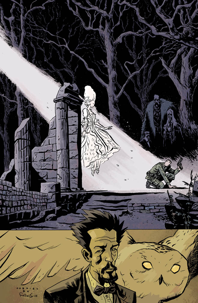
FABIO MOON

Fabio Moon is a Brazilian comic book artist who is known for many collaborative works with his brother and other artists with similar tastes in drawing style. Jess suggested this artist after our group critique session and I was very interested in learning more about his work.

Style-wise, this artist reminds me somewhat of Dave McKean in his use of commercial comic-book materials with a dark twist. Moon is very skilful in terms of layout and creates narrative pages with minimalistic amounts of dialogue, so his art work fills the page and isn't smothered in white text boxes like so many other published comics.


He uses traditional materials and works mostly in black and white, which serves well to showcase his great inking abilities; however I also admire his beautiful watercolour pieces. These are not as popular for commercial use due to the cost of printing, but are fascinating as stand-alone works.


To get a better understanding of his work as a narrative, I am planning on reading one of Moon and his brother's Horror comic books "Pixu" as I feel the themes of the story are relevant to my project. Hopefully I will be able to gain some inspiration from their use of panel layout to create my own illustration sequence with limited dialogue and allowing the images to tell the story.

Saturday, 2 February 2013

DAVID FIRTH

After the group critique, Jess suggested that I research the cartoonist David Firth as she felt his bizarre and often disturbing animations would fit in well with my project. This was a very helpful suggestion as I found a lot of interesting features of his work that tie in well with my theme of dark narratives. Whilst discussing the artist with Mike and Emily, Mike suggested I watch his "Black and White Cartoon" series.


Although the piece is not obviously humorous, I found myself laughing uncomfortably during moments of these pieces. Firth always achieves a reaction from his audience, and I believe that may be the aim of his mostly disturbing pieces. This reminds me of my Heart Eater comic and some of the repulsed reactions I received from readers in my class as the ending and themes of the story weren't as "positive" as they had expected.


I remember watching this internet series of animations titled "Salad Fingers" by Firth whilst I was much younger. My friends and I would squeal and cringe at the actions and behaviour of this creepy character and the memory of it has stuck with me. Firth does well to induce a reaction in his audience and create an almost haunting memory with his characters and dark themes. I think this is much more effective than creating something "safe" or "family friendly" as it shows little exploration of the dark corners of the imagination that exist, and mostly results in something bland and very easily forgotten.

By exploring controversial themes of mental illness and generally not-very-"Disney" characters, this cartoonist creates animations that people will discuss, share and react to.

To help my work progress I think it may be necessary to not focus on things that are visually appealing or safe and to move onto more graphic and experimental imagery, such as is seen in David Firth's own work.

Friday, 1 February 2013

SKAIJO

Skaijo is one of my favourite animators for her hilarious short animations. She posts her work on sites such as YouTube, deviantART and Newgrounds. She works with the program Flash to create pieces with a very distinctive use of character design and animation style.
This is one of her less "comedic" works, however it still depicts elements of humour. Looking at Skaijo's work is very useful for my project as she has skills in producing narrative works even without dialogue. Viewers have commented that the characters are difficult to tell apart due to their similar colour schemes, to which she replied that she grew up in a place where most people have similar skin/hair and eye colour. In my opinion, she has used her fictional race of people well as she has managed to create character designs that show they belong to the same race and culture and has used her knowledge of design to bring each personality out in her drawings and use of clothing/hair style.


This next animation is part of Skaijo's ongoing series "Professor Layton and the Malignant Growth" which is very darkly funny and entertains it's internet audience using pop culture references and surreal characters. I enjoy watching these stories due to the hilarious mix of dark or taboo situations and comedy. In these short animations the characters appear very scruffily drawn which seems typical of an internet cartoon, but rather than being a disadvantage, Skaijo is still able to create expressive characters and convey comedy and narrative.

After looking at Skaijo's work I have begun to draw character designs for my Masque of the Red Death illustrations and will be posting my ideas soon.