Thursday, 31 January 2013

Constructive Critique

Today our class was split into groups so that we could discuss each other's work. I was put into a group with Jess, Ben and Theo.

I had to explain my project so far, what my work was about and how certain artists I had researched had influenced my work. We discussed what work I could make for Berlin in relation to my narrative project and the group came up with some interesting ideas. One suggestion was that I find some way to creep people out and perhaps make a comic or series of illustrations depicting their reactions.

They then gave me some more artists to look at; Jess suggested David Firth and Fabio Moon who I have decided to research more into as their work appears to be very interesting as well as relevant to my project.

We repeated this process with each group member until we had all discussed each other's work and provided relevant artists to help us progress.

I found the group critique to be very useful as I enjoyed listening to the opinions of my peers as well as learning more about their work. They have given me some great ideas to help me further my project as well as extra artists for me to gain inspiration from.

Friday, 25 January 2013

MIKIKO PONCZECK

Mikiko Ponczeck is a published comic book artist. Like Alfredsen, she often draws in her own cute style.
Her "minicomics" are very funny and use situations from her everyday life. I like these drawings, but for my project I am more interested in her darker, more serious pieces.
Ponczeck has a very bold illustrative style but knows how to use it to depict more depressing themes.
This is my favourite comic page by this artist as she took an ordinary pencil sketch and coloured it digitally. It creates a more delicate effect than harsh black lines that are produced by computer programs and the sketch lines add a sense of structure and fluidity to the piece as a whole.
Her drawing processes are interesting and I find it enjoyable to see how a professional turns a pencil sketch into a finished product that is suitable for a paying client or for publication in an artbook or comic series.

Tuesday, 22 January 2013

Heart Eater Comic

In response to Tina Alfredsen's work and distinctively adorable style of drawing her many characters, I decided to make my own "cute" comic but with a dark theme to connect it with my project. On a large sheet of paper I worked on a simple concept I had in my head.
Using waterproof ink I outlined the panels I had sketched. I made a few mistakes early on, such as the ink dribbling down the page so I learnt quickly to only have a very small amount of ink on my brush.
As there were only a few characters, I didn't make any design sheets. I just kept them simple and drew them how I imagined them at first. I numbered the panels to make the story easier to follow. Using a thinner brush, I inked the sketch. I like how this makes the characters look bold and stand out, like the thick black lines used in Alfredsen's comic.


These are some close up shots of the panels. Because of the size of the paper, I found it difficult to get clear photos of the piece as a whole.
To make the characters stand out more, I diluted some of the ink and used it to add tone onto my work. I let the ink dry and then painted some more lines over the top to create shading. To make certain objects stand out, I used a pink watercolour. I didn't want to use too many colours as I didn't want it to look over the top or confusing to read.
I like how this came out and I found the combination of cute and creepy to be quite humorous, as it seemed to toy with the reader's perception of how the comic should end. Most people who saw it were shocked by the ending and were quite upset that it wasn't the cute story they were expecting.
I enjoyed working on this larger scale as I'm more used to A4 sized comics, so I have decided to make my Masque of the Red Death comic a similar size to this, if not bigger.


Friday, 18 January 2013

TINA ALFREDSEN

Tina Alfredsen is an artist who works for an animation/game studio and also draws on comission via the internet. She creates a huge variety including paintings, animations, comics and pixel art. Alfredsen has a very distinctive "cute" style of drawing".
She has a great understanding of colour theory, so her pieces are always attractive and pleasant to look at.

My favourite thing about Alfredsen's work is her use of facial expression which makes her characters look fun and cartoon-y.
Of the many small animations she makes, I chose to feature this longer animation as it is a great example of her knowledge of movement and use of character design with expressive faces and motion.
In response to Alfredsen's work I have decided to make a comic that emulates her cute style and use of facial expression, but I am going to keep within my theme of dark story telling. I think the juxtaposition of cute drawings with a creepy story line will be interesting to experiment with. 

Thursday, 17 January 2013

The Scab Man (Finished Comic)

These are the processes I used to turn this poem into an A3 comic page.


I took the poem and made a comic plan. I drew out the boxes based on my ideas of what I wanted to draw in each panel and it's corresponding line in the poem. I created the sketchy effect by scribbling with black biro and pencil. I like the dark, scrawling effect of these boxes as opposed to my usual solid-line style. This page was photocopied several times so I had copies on which to experiment and sketch out my ideas.


I made this sheet to remind myself of where I wanted each line of the poem to fit in the page.


This is one of my sketches that I began to apply lineart to. I used water-soluble ink as my original idea was to create tone by adding water and blending the ink to create a grey image.
The style of drawing figures here is similar to how I usually draw, but I tried to incorporate the more solid, expressive style used by Aitor Throup to add more depth to the characters.


Here are the finished lines with all of the backgrounds drawn in. I decided not to erase the pencil sketch underneath as I liked the sense of history in the image and it also reminded me of how William Kentridge built up layers in his animations.


I began adding tone by applying water to the dried ink, causing it to bleed and turn the surrounding areas grey. For the areas I needed to be darker or solid black I added black watercolour paint. I felt the piece was looking a little flat so I decided to experiment with adding small amounts of colour to it.


Firstly, I painted the gaps between panels black so that the images would stand out more. I think it also adds to the darker atmosphere. I began adding colour to the characters to make them stand out from the background. I liked how the watercolours looked so I decided to continue adding colour. I didn't want to add too much as I didn't want the piece to be overly bright as this might destroy the serious/scary aura I wanted the reader to perceive. I watered down most of the colours after this so everything still had a greyish tinge to it.


After the paint had dried, I went over most of the lines in black pen again to make the images sharper and easier to look at. I also added highlights with white gel pen to stop the drawings from feeling flat. I printed out IPostAtMidnight's poem and placed the lines into the relevant panels.

Monday, 14 January 2013

AITOR THROUP

Whilst researching illustrations, I discovered Aitor Throup who is a fashion designer. He creates bizarre and almost sculptural fashion pieces for men and his style of sketching designs caught my eye.
  
 
Most fashion designers use plainer, "mannequin" like sketches of models to design their pieces onto, whereas Throup puts strong poses into his sketches that bring out the personality of the clothing.
 
 
The figures have muted colour schemes and come across quite twisted and "creepy", somewhat like illustrations for a dark fairy tale.
 
I find this dark style of bringing across character through fashion very interesting and would like to try sketching the characters from The Masque of the Red Death in this way as they wear very gothic and ornate clothing. I feel this will bring across the heavy atmosphere of the story and bring out the creepier side to what, at first, appears to be a celebratory, jovial masquerade ball.

Friday, 11 January 2013

Masquerade Photos

Using members of my class as models, I took some reference photos for my Masque of the Red Death comic in a similar way to how Vitaly Alexius begins his work.
 
I had a rough sketch of each panel of the comic that gave me a general reminder of the perspectives, room space and poses that I wanted. I then asked my models to assume these poses. In some circumstances I directed them as I had a clear idea of what I needed, for other scenes I told them the scenario and let them react to it in whatever way they deemed fit.
 
Here are some examples of the 40 photos I took. They include full-body poses and headshots for facial expressions.


Getting these photos was often difficult, as there was no studio space available to me like that which Alexius would use. Also, I needed certain features like staircases and corridors for perspective references which meant that photos were often interrupted by other students and I had to take into account health and saftey issues such as not blocking doorways whilst taking the photographs.
Despite this, I got all of the photos I needed and feel that they will be excellent to work from. 


Thursday, 10 January 2013

NAJA CONRAD-HANSEN

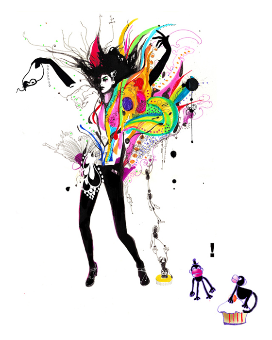
Naja Conrad-Hansen is an illustrator known for her use of traditional media and bold style.
Her illustrations are quite loose and graphic, she tends to remove parts of the anatomy of her figures and work in bright paint drips or intricate patterns.
This particular image is a favourite of mine as it shows the wild patterns becoming the girls clothes and the mask in her hand made me think about what designs I should make for the costumes in my Masque of the Red Death piece.
I find this images striking due to the almost sexual or sultry nature of some of them and also the whimsical poses of the figures combined with the wild bursts of pattern.
I plan to combine this style of drawing with that of Aitor Throup as I hope to bring across a dark aura in my illustrations for the comic piece.

Wednesday, 9 January 2013

Collaboration Comic

Our tutor Steve suggested that I make a collaborative comic strip with Emily, who has also been working on large-scale comic pages. He said he'd like it to be something about the Foundation course, or college life so Emily and I discussed our ideas and made a plan.


We both agreed on a story for the comic page; although Steve probably intended for us produce satire about college, we decided to poke fun at the tutors instead. We made a rough sketch of the panels and possible dialogue and omitted any panels that wouldn't fit or weren't necessary and refined the text.

In one of the panels, Steve's bike is on fire and Steve let us photograph his bike so we could draw from the photos.


This is our finished comic page. We used a large sheet of paper as we were both used to drawing on this scale. We decided on a style we could both replicate so that the differences between our drawings weren't noticeable. I sketched the right side as Emily did the left and then we switched and inked outlines onto each other's drawings.

 I think the comic came out well as our classmates enjoyed reading it, although I don't think Alistair approved of us depicting him in this way. Emily and I found it very easy to work together by making quick decisions and sharing our sense of humour. I feel the comic fits in nicely with the rest of my work as it appears cartoon-like and fun but is actually telling quite a twisted story. Emily and I discussed burning the edges of the comic but I worried a little that the whole thing might go up in flame, and in the end we both decided not to do this as we had other work to get on with.

Monday, 7 January 2013

VITALY ALEXIUS

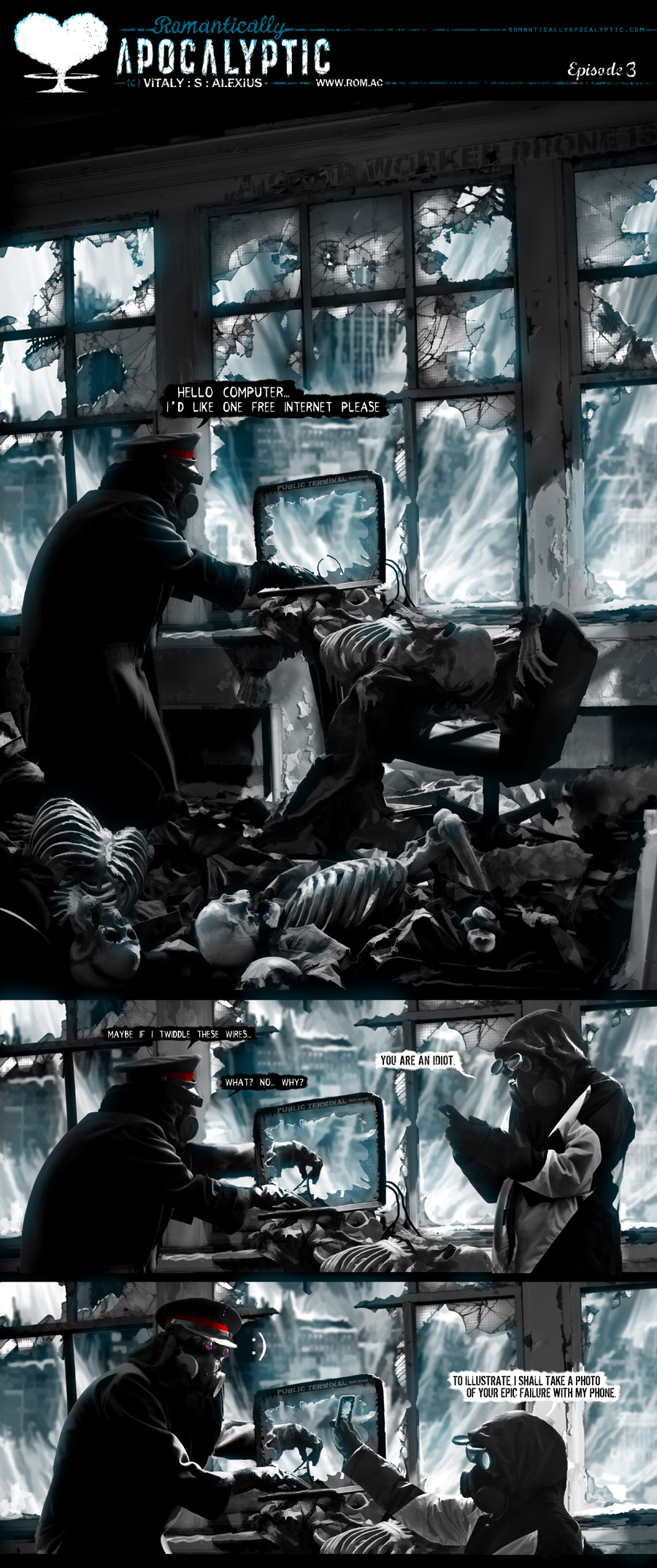
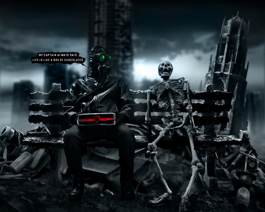
Alexius is the creator of the webcomic "Romantically Apocalyptic". His comics are made up of semi-realistic digital paintings.

He places his characters in humorous and and far-fetched situations based in a post-apocalyptic city. Alexius digitally paints fantastic and wild scenery by building up layers so that they almost look true to real life (if such places existed!).
Alexius creates these paintings by photographing models in a studio, then painting from the photos. This helps him to achieve a realistic effect.
Here he shows how he creates a script and a rough sketch of how he wants his panels to look. Then he takes photos of buildings and models in his studio to paint from. He then uses the photos to paint his comic in Photoshop.

For my Masque of the Red Death comic I plan to use this technique and photograph people in the poses I need for each panel and then draw from them. This will improve my comic by making it more realistic and structurally sound.